Search Nerdbloggers:

Entries in review (31)

Monday
Aug062012

Nightfall: The Coldest War - Staking New Territory


I've been playing Nightfall since it first came out, and have been impressed with the low-downtime cutthroat fun delivered through it's unique chaning mechanic. In my review of the last expansion in the series, Blood Country, I had expressed some concern that the Tru-blood style settings and themes in the various Nightfall entries were becoming somewhat similar. Almost as if AEG has read my mind, I find the newest expansion The Coldest War half a world away from the humid nights of the American South, revealing instead how Nightfall has affected the cradle of vampire myth: the fridgid tundra of mother Russia.

Nightfall: The Coldest War not only opens up a refreshingly new thematic setting, it also introduces the widest variety of changes to core gameplay so far in the series. With new starting minions, moon phase cards that change the overall playfield, a couple of new mechanics that turn the game on it's head, and a set of fully illustrated wound cards, there is a ton of new content packed in the box.
Like Nightfall: Martial Law, The Coldest War can be played as a standalone game. However, where Martial Law duplicated some cards from the base set, The Coldest War presents an entirely new cast of starting characters, as well as gives all of the wound cards a graphical facelift. If one word can describe The Coldest War, it is "change".

Has this new Nightfall toppled a Berlin Wall-like barrier holding back it's thematic potential, or has it dropped like an Iron Curtain separating the new play experience from it's core audience? Let's take a look at the new changes in a bit more detail, and I'll give you my impressions.

Setting:

The biggest change to the game is the new setting. In what seems like a complete reversal of the Tru-Blood style Americana slasher, Nightfall: The Coldest War opens up an entirely new continent with plenty of supernatural lore to explore. As children, practically every one I have known has played make-believe as the stereotypical movie vampire while laying on a thick slavic accent. The minions in The Coldest War may be foreign, but their horror heritage will allow any players to comfortably assimilate the thematic flavor that theiy bring to the game. That's not to say that Nightfall has done a 180, and is delivering 1800's dracula; Not at all, it's still the same mix of urban decay Nightfall does so well - but the minions and artwork in this expansion have a bit more foreign charm than the previous settings.

I really like this detour in setting. I was getting a bit bored with the sameness of the theme in the previous expansions, and I was pleasantly surprised at how refreshing a simple change of locale made to he gameplay experience. I hope that AEG continues along this line and explores all of the shadowy nooks and crannies of the newly decaying world.

Mechanics:

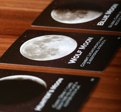
Moon Phase - One of the biggest changes introduced by The Coldest War is the inclusion of Moon Phase cards. An optional addition, moon phases are represented by a small deck of cards, each card depicting a certain phase of the moon. Each moon phase adds a global effect to the game, usually helping or hindering a particular type of minion (Lycanthrope, Vampire, Ghoul, etc..). Players can choose to manipulate these cards on their turn by blindly drawing the next one from the deck or shuffling the deck. 

This gives an interesting flavor to the game, and although there is a bit of allowance for strategy when deciding when to draw vs. shuffle, it is still pretty random. It definitely spices up the game, though, and actually gives some purpose to the different minion types. Players may be divided about whether or not they like this particular mechanism, but it's optional status means that it can easily be left out if it is not your cup of tea.

Combat Effects - While the moon phase cards may seem like a big change to the game, the biggest change is actually much more subtle. Many cards in The Coldest War contain combat effects: actions that can be taken during combat by playing the card directly from the player's hand without chaining. This will probably be the most controversial aspect of this expansion. The chaining mechanic is really the core of Nightfall, but these new combat effects essentially bypass it. These effects may be likened most to "instants" in Magic the Gathering, allowing players a chance to save themselves or damage others out of turn. We have seen this mechanic before in some of the wound cards introduced in previous sets, but The Coldest War really brings the concept into the spotlight.
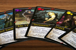
Personally, I like the addition. One of the apparent shortcomings of Nightfall after many plays is that it can be prone to "Kingmaking", where all of the players beat up on another - virtually forcing him out of the game. The ability to more nimbly counter these attacks takes some strides to level the playing field. Players may feel that these cards are a bit more powerful than the standard cards due to the fact that they have potent effects without having to consider their colors, but I felt that they brought an interesting, refreshing twist to the formula.

New Wound Cards - The Coldest War not only introduces new wound cards with a flexible effect that acts as a wildcard to chain any two colors together, it also includes cards from the previous games with slick new art that is much nicer than the simple bullethole graphic found in the original. Since each of the older expansions have unique wound effects, this is actually like getting bonus cards in the coldest war expansion. (Even if you are like me and snag each new expansion as it comes out, the new art is worthwhile in and of itself.)


New Starting Decks - While every full expansion up until The Coldest War has included a set of starting characters, they have been the same familiar faces in each set. With the setting change in The Coldest War comes a new cast of starting characters as well, which is a breath of fresh air. I'm not sure that these new characters were built with beginners in mind though, as their effects and powers are a bit more nuanced than the basic set, with one or two that may seem downright weaker at first glance. As a set though, these new starting characters are balanced and play differently enough to be worth exploration. I am already starting to notice changes in my strategies while utilizing these new starting cards.

Conclusion:

The Coldest War definitely has a new feel to it, and plays much differently than the previous games. The combat effects really change things up and create a faster, more aggressive, and immediate game. I can't help but feel that Coldest War brings a bit more "Magic the Gathering" flavor to Nightfall, by adding more complicated interactions that require a new type of thinking about how, and where cards can be utilized.

While this new mechanism seems to address kingmaking a bit, it also makes the game much more cutthroat, and changes its nature significantly. If you want more of a CCG feel in your Nightfall, then this will be an excellent addition, but those who feel that Nightfall is already too chaotic may want to steer clear. I enjoy the new mechanics, and feel that they help revive a game that was starting to falter with expansions that were beginning to feel too similar.

Some players may feel that the optional Moon Phase cards add a bit too much randomness to the game as well, but I really enjoy that the moon phases give more purpose to the different creature types found in the decks, delivering an added dimension of strategy to the card draft process. I may not use Moon Phases in every game I play, but the ability to add them on a whim is a welcome inclusion.

I think that Nightfall was really due for a refreshing change, and The Coldest War really delivers. There is enough newness here to last for quite a while. That being said, The Coldest War may not work very well as an introduction to Nighfall - the new mechanics all bend the basic core of the gameplay, and while exciting for the veteran player, this may seem aimless and without focus to the beginner. If you are looking to dip your toes into the Nightfall universe for the first time, the base game is still the best entrypoint.

All in all, Nightfall: The Coldest War is a solid entry for the veteran Nightfall player and should scratch the itch for those who are looking for something to spice up their gameplay - just be aware that this changes the nature of Nightfall quite a bit, and may require a paradigm shift in strategies that are used to succeed.

Thursday
May242012

Sentinels of the Multiverse: Rook City - A Review


Over the past few months, Greater Than Games' superhero card game Sentinels of the Multiverse has seen quite a bit of table time at my place. Its thematic roller-coaster pacing only seems to get better as time goes on. Rook City, the first expansion to the series, ratchets up the fun through the inclusion of new villains, heroes, and environments from the seedy underbelly of the sprawling Rook City. The expansion also subtly adds to the game mechanics a bit, by adding a new scaling mechanism that helps the game maintain balance  with differing player counts, as well as a couple of new attributes that modify how much damage can be dealt during an attack.

Christopher Badell, Greater Than Game's Design Director, was kind enough to speak with us about the Rook City expansion when it was being funded on Kickstarter, so it was a treat to finally bring the game to the table, and see what Greater Than Games had really been plotting in their hidden fortress. Since I have previously reviewed the Sentinels of the Multiverse base game, I am not going to talk about the rules of the core game, but instead focus on the successful tweaks to the formula, as well as the interesting and engaging characters and environments that have been introduced into GTG's Multiverse.


Components:

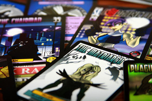
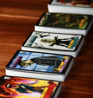
Like Sentinels of the Multiverse, Rook City maintains the card based nature of the game. Even without a box full of components, Rook City manages to capture the visceral essence of a comic book story. It shares the same expressive, colorful artwork that the original game introduced, through the quality cards and colorful box.

The biggest visible difference with Rook City is its box. Not only does it have a higher quality linen finish, but it contains a custom insert that holds the cards perfectly, and removes the need to separately bag cards. The custom insert is a step in the right direction, but there are still some issues with the new box as a storage solution. First of all, it isn't really built to hold all of the cards in the game - the cards from the base game, and the Rook City cards will have to stay quarantined in their own respective boxes. Second, there is no easy way to separate the cards. The way the cards are stored in the new box doesn't really allow for baggies or tabbed separators. (However, Greater than Games is addressing this issue in tandem with the second expansion, by releasing a new box that will hold all of the cards for the base game and expansions.) When push comes to shove, though, the amount of space that Sentinels and Rook City take up on a shelf is still much less than most deck builders.


New Mechanics:

Rook City introduces some new mechanics to the game. Unlike expansions in many other games, these rules are all self contained. The basic game rules remain untouched, and new mechanisms are introduced only in the card text of the Heroes, Villains and Environments in Rook City. Since cards from different games are never shuffled together into a single deck, it allows GTG to craft new play experiences in Rook City, without affecting the play experience in the base game.

The first, and most important change is the addition of a new symbol to Rook City cards. This symbol looks like an H with a circle around it, and is always interpreted as the number of heroes in the current game. One of my concerns with the base game, was that it did not scale well. The villains and environments had a fixed difficulty regardless of the number of players. This made a 3 player game much harder than a 4 player game. With this new scaling mechanic, however, the Rook City villains and environments can now scale in difficulty based on the player counts.  It's always a bit scary when game designers start tinkering with a system that already works, but I am happy to say that Rook City maintains the dynamic, tense flavor of Sentinels, only now it allows for a much more flexibility in player count.

The other two changes to the game's mechanics are more minor, although fairly pervasive throughout the new decks. One identifies a target as invulnerable, while the other ensures that damage done cannot be reduced in potency. These effects could have been written into the descriptions on the appropriate cards, but by introducing them as keywords, a lexicon is being created for the game that can be built upon in later expansions. Although these new mechanisms may seem minor, the cards that utilize the new keywords can really add a feeling of both power and dread to the game, further supporting the cinematic feel of the game.


Cast of Characters:

When it comes down to it, the success and charm of both Sentinels of the Multiverse and Rook City are delivered though the individual characters in the game: the villains, heroes, and environments. Yes, I realize that I just called the environment a character in the game, but I still believe that the environments have so much character, they become anthropomorphic in their own right. Since the characters are the heart and soul of the expansion, I would like to talk about each of these 8 personalities separately.

Villains

The Organization - The Organization is a corporate juggernaut that secretly controls Rook City in it's shadowy back rooms. Led by a man called only "The Chairman", and kept in line by a formidable woman known as "The Operative", The Organization is a doubly tough nut to crack.

Where most villains have a single leader that needs to be defeated, The Organization starts with two villains on the table. In line with the typical hierarchy of a corporation, players will have to fight tooth and nail through a bureaucracy before finally defeating The Chairman. The way The Organization deck is structured, there are various underbosses who continue to bring thugs into play; and The Operative, who brings the various Underbosses into play. Not only are waves upon waves of minions delivered to the players during the battle, but the Chairman is completely untouchable until The Operative has been dispatched.

The thought that was put into this villain deck to create mechanisms that reinforce the feeling of a corporate hierarchy are incredibly inspired. This is the sort of attention to detail that gives Sentinels it's uniquely effective theme without having to punt on the gameplay. This villain deck reminds me of a Saturday Morning Cartoon, or an 8 bit beat 'em up video game; the players have to battle through what seems like an unending wave of thugs in order to defeat the mini-bosses, and the end culminates in a two part boss battle where the boss's defenses have to be penetrated before he can be ultimately defeated. This is a narrative arc that has been found in movies, books, and video games for years, because it works so well at an instinctual level. It's no surprise that it works in Rook City as well, as this is a very dynamic and tense battle.

Spite - Spite's story taps into the idea of the government meddling in the affairs of men and creating damage that it cannot control. Similar to the theme in classics like "A Clockwork Orange", where the government uses prisoners as test subjects for questionable experiments, Spite's story is one of a serial killer who is given an opportunity to commute his death sentence by being a lab rat. Unfortunately, the experiments that were performed turned Spite into a monster of unimaginable violence and power. He easily escaped his confines, and now roams the city feeding his unquenchable thirst for murder and pumping his twisted body full of chemicals that give him superhuman strength.

Spite's deck is very unique, and has two main themes that run through it. The first is his insatiable need to kill innocent people. Throughout the deck are victim cards that represent innocents which the heroes can save by completing tasks on the card's text. If the heroes chose not to save the victims, they are quickly dispatched by cards brought into play from the villain deck, causing damage to the heroes, or greater strength to Spite. This is another clever mechanic that forces players to act like heroes. In most of the other villain decks, the heroes are put into a position where fighting is the only purpose, however Spite's deck introduces heroic sacrifices that the players must perform in order to save innocent victims. This changes the mood of the game and the motivation of the players, and surprisingly ratchets up the SuperHERO nature of the game.

The second theme in the Spite deck is chemical mutation. Along with the victim cards in the deck are a collection of chemicals and mutagens that strengthen and change Spite's behavior, forcing players to balance their attacks on Spite with the attempts to save the innocents, and causing the flow of the game to swing between the two objectives. 

I find it very refreshing that the Villains themselves really dictate the theme of the play experience, and each one can be drastically different. This modular nature makes me excited for the future of Sentinels, and the ability for the game to persist and continue to deliver new and unique play experiences without the need to rework the core mechanics.

The Matriarch - The Matriarch takes a page out of Alfred Hitchcock's playbook by making birds terrifying again. The Matriarch's power is granted by a magical mask that allows her to commune with the flocks of avian minions.

The key theme in The Matriarch's deck is swarming. As long as her mask is in play, the villain deck is cycled, bringing continued destruction to the table until more birds appear. This causes the play area to fill up with more birds every turn, turning the play area into a seemingly unending cloud of wings and beaks. 

Like the previous villains, The Matriarch's deck is very thematic in its execution. The mechanics that bring about this feeling don't seem as creative as the other villains, though. The Matriarch has less of a roller coaster pacing to her cards, and instead feels a bit more like a hopeless grind to the finish. That's not to say that she isn't a compelling villain, just that the others produce a more interesting play experience.

Plague Rat - Plague Rat is a mutant half-man half-rat produced from the mixture of drugs and toxic waste spewed from the poorly regulated factories and industrial plants in Rook City. While years of criminal control has transformed Rook City into a toxic hive of villainy, the corrupted sewers have turned this former drug dealer into a noxious villain.

Like Teenage Mutant Turtles gone horribly wrong, Plague Rat could be likened to an evil alter ego of the good and protective Splinter. With veins filled with pestilence and toxins, Plague Rat's bite has lasting effects, theming his villain deck with poison and infection. Where other villains bring minions to the table that protect and divert attention, this rat-man wages a one-on-one battle with the heroes using only his debilitating bite which can turn the heroes against each other and themselves. Once all of the heroes are infected, their only remedy against the poison is to do damage to friendly targets.

I really enjoy the way that Plague Rat mixes up the Sentinels formula. By forcing the players to attack each other, it creates the feeling that the heroes are afflicted by a mind altering pathogen that turns the conflict against Plague Rat into a conflict of self as well. When you think about it, that is a pretty deep theme for a simple card game.

Heroes -

Expatriette - The first of the two heroes included in the Rook City expansion would give John Rambo a run for his money. Daughter of the villain "Citizen Dawn" in the main Sentinels game, Expatriette is a master of firearms with her sights on bringing justice to the world one bullet at a time.

Expatriette's deck is filled with firearms and ammunition, and her gameplay is all about swapping weapons and keeping them loaded with a variety of different types of rounds. Playing this harbinger of pure firepower is like standing next to a hailstorm of bullets. It's easy to imagine the game shifting into slow motion as the smoke swirls around her and the bullet casings spill to the ground, clinking against the pavement like steel rain. She may be straightforward to play, but the feeling of pure unadulterated firepower she presents is a lot of fun.

Mr Fixer - If Mr. Miyagi from the Karate Kid dropped the home maintenance angle and decided to start breaking evil's kneecaps, the result would be Rook City's Mr. Fixer - an ex martial arts instructor, who has turned his life to the pursuit of extracting justice for the brutal slaying of his students.

With an arsenal of car repair tools and knowledge in a myriad of martial arts styles, he is a force to be reckoned with; changing up his nature like others change clothes, and keeping his enemies guessing. Through the use of the different cards in his deck that represent tools and fighting styles, Mr. Fixer plays like a bunch of different characters in one. Choosing what style to use at any given moment can be very strategic, and empowers the player to feel like he is defeating his enemies not only with superhero skills, but with a calculating mind as well. While more subtle than Expatriette, he is just as fun to play.

Environments -

Rook City - Rook City is dangerous in many ways. Its sewers run green with toxic sludge, its crumbling buildings threaten to crush the unaware, and dangerous criminals roam it's darkened alleys. The villains that the heroes must confront are tough, but the city itself may be their toughest obstacle. That's not to say that Rook City doesn't have it's share of citizens working for the greater good. Even in an unlikely place like this, heroes may find some allies... or at least distractions for the enemy.

The Rook City deck may represent the most common type of environment found in comic books - the crime infested city. This common theme isn't a bad thing though, as it fills a thematic hole in the base game. The heroes of Sentinels needed a city to clean up, and it has been graciously delivered to them by Greater Than Games in the form of Rook City.

Industrial Complex - Lots of crazy things can happen in an Industrial Complex when there is little to no regulation. Filled with science experiments gone bad, the complex in Rook City has wonders that can both help and hinder hero and villain alike. But some of the technology found here isn't fully baked, and can combust in a shower of green goo and pain. Oh.. and watch out for the vermin that roam the dingy hallways - this Industrial Complex prefers to spend it's money on research over sanitation.

Unlike the Rook City deck that seems tipped in the villains' favor, the Industrial Complex is fairly neutral. The different vat cards stay in play and have effects on both villains and heroes alike. Sprinkled through the environment deck, however, are chemical explosions which cause the vats to blow up, and cause damage to all targets in play. The rat cards in the deck can be a hindrance, but if the experimental mutagen card comes into play, all of the rats will come out of the discard pile, and they will be much tougher to defeat.

Out of the two environments, I think that the Industrial Complex is my favorite. The cards within the deck seem to have more interplay with each other, and there is a lot more potential for catastrophic damage, both to the heroes and the villains.


Conclusion:

All in all, I was extremely impressed with Rook City. Not only did it rectify some of the scaling issues from the base game, but the heroes, villains, and environments were all a blast to play. The components themselves were also upgraded with higher quality cards and a box that allowed for better organization.

The only complaints that I have about the expansion are minor. While the box is better than the one in the first game, it still doesn't really address the storage problem with the game. Greater Than Games has plans to address this in upcoming releases, but until it is in my hot little hands, I'll have to make due. 

I suppose that it is also bit disappointing that the scaling mechanic only works for the Rook City cards. It would be nice to have the effects retroactive into the base game. This too is being addressed in a re-release of the base game, though, so players will soon have the opportunity to play with the best of both worlds.

It's rare that I have practically nothing negative to say about a game, and wax lyrical about it instead, but I find myself in that position with Sentinels of the Multiverse: Rook City. The additions in the expansion only work to enhance the game experience, and every one of them is welcome and well conceived. If you own Sentinels of the Multiverse already, Rook City is a must buy. If you don't own Sentinels of the Multiverse, wait for the second edition of Sentinels to be released, and then buy it - along with Rook City!

Sunday
May062012

My Experience With Geek Chic - Part 2


Several months ago I wrote about my initial experiences ordering a Geek Chic Emissary table. I promised a follow-up when it arrived, but I decided to wait a bit longer (which turned into a lot longer) before writing about the table so that I could give a better impression of what it's like to live with one. I've had my Emissary now for a little over 8 months, and while I love the table and I'm certainly glad I made the purchase, there are definitely some quirks that only become apparent after spending some time with it in the family.

The Table:

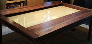
The table I purchased was a Walnut Emissary with a 6' x 4' play area and a bamboo vault surface with a plexiglass layer. I chose to forgo drawers in the table and opted instead for the rail system that allows accessories to latch onto the sides of the table. My main reason for this choice was that I play mostly board games and don't have much need for the accoutrements required for Role Playing Games.

The actual delivery of the table was scheduled about a week before the delivery date, and was set up by two friendly Geek Chic employees. Setup took less than 30 minutes, and was a fairly painless process. The fact that my game room is easily accessible helped. Someone with a narrow staircase, or tight turns in their hallways could potentially run into some issues due to the depth of the tabletop. After the table was assembled, I was told about its care and feeding and how to transform it into various configurations.

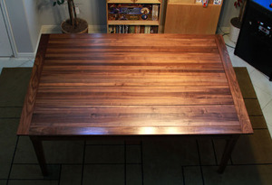
The table itself is well built, sturdy, and looks very sleek. The grain of the wood is almost iridescent, and reflects light differently from different angles - a very pretty effect that none of my simulated wood grain or veneer furniture possesses. Since walnut has different shades of color depending on where in the tree it comes from, the table has a lot of character.

After the table was assembled, we discovered that it was missing a couple of brass pins that belonged to a removable support structure that kept the table leaves from sagging. Since these pins weren't critical, Geek Chic had them mailed to me a few days later, which was a painless process. However, I also found that one of the leaves in my table was not lying flush with the surface of the table, and it appeared to be slightly warped. I was told that wood was malleable and would flex and change, and to invert the leaf and let gravity help get it back into shape. 

I was not 100% thrilled with this suggestion. After all, I had just paid $4000+ for a brand new table, and it seemed to have a flaw, but I took the advice and flipped the leaf. After a few months it wasn't warping as much, but it still wasn't lying flat, so I called Geek Chic and they agreed to replace the leaf when they had another delivery in my neck of the woods.

About 2 months later my new leaf was delivered, and it fit perfectly into place. This new leaf is a slightly different color than the others, but it was explained that the wood changes color as it ages, and since the rest of the wood in my table is 8 months older than the new leaf, it will take time for it to catch up. I'm sure the colors will mesh better as the table ages (even in the past few weeks i have seen a difference in the color of the leaf), but it still makes me a bit nervous and I wish that the issue was addressed by Geek Chic earlier in the process. (If it looks like one leaf is slightly off-color in the photos, that is why - it is not indicative of how the table arrived.) All in all though, it was a positive experience, and I'm sure if I had been adamant that the leaf be replaced earlier, Geek Chic would have accommodated me.

Features:

Rail System - Instead of drawers, I chose the rail system for my table. The rail system is a groove that extends along the side of the table, onto which different accessories can be attached. The only accessories I purchased were cup holders, but I can see myself ordering a few desk or bin attachments in the near future.

Because the rail is just a groove in the wood of the table, it can't support a lot of weight. This makes it perfect for cup holders, or other small accessories, but care would have to be taken with a desk or any other accessory that someone might be tempted to lean on. In fact, since the cup holders extend past the edge of the table when inserted into the groove, I've had a couple of close calls with people bumping into them with their legs while standing up, or walking past. This doesn't make them non-functional, it just means people need to take care when moving around the rail accessories.

Rail accessories come in two types: locking and non-locking. Locking accessories have a little latch that has to be pulled in order to remove them, or slide them along the rail, whereas the non-locking accessories do not. I chose the locking cup holders, and have found them to be very functional.

In what is a bit of a trend with the accessories for the Emissary, it is important to have a place to store the cupholders. While the wooden brackets can be stored in the closed table, the metal part of the cupholder is too tall to fit in the table vault, and will have to be stored elsewhere.

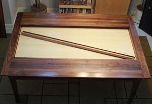
Table Vault - The coolest part of the Geek Chic Emissary table is the "Vault". This is a recess in the table where games can be left in-play, and then covered with the hardwood leaves. Since there are several inches between the surface of the vault, and where the leaves slide in, the game can be kept in stasis under the leaves, while the tabletop is used for other normal table-like activities (or another game!). 

It's important to note that the leaves do not fit together tightly enough to make a waterproof seal. If you plan on using the table for dinner, I would definitely suggest using a tablecloth with a waterproof liner. A spilled drink would still leak into the vault and cause all sorts of destruction. I don't actually eat at the table, so spills aren't too much of an issue for me, but the kids often do their homework on it, and so I will often find a million little eraser shavings in the vault when I open it. While the Emissary is very effective at its dual purposes, little things like that can be frustrating and being preventative can go a long way to restoring sanity.

The vault also has the option for a plexiglass sheet that fits over its surface. This is really nice for multiple reasons. First of all, it can be written on with wet or dry erase markers. This may be more of a feature for the RPG gamer than the board gamer, but it's still really neat. Second, people who enjoy playing games that use paper maps or boards will find that putting them under the plexiglass will keep them flat. I've found this incredibly useful when doing reviews, and taking photos of wargames and print & play prototypes.

The plexiglass will have to be removed from time to time and cleaned. It is inevitable that little pieces of dirt and dust will find their way between the plexi and the vault surface. Geek Chic includes a cool suction tool to remove the plexi (It looks like something James Bond would use when he's cutting a hole in an alarmed glass case), although moving a 6' x 4' piece of plexiglass is still quite a task.

Leaves -The 5 leaves that cover the table vault are all made of solid hardwood. They look really nice, but are surprisingly heavy, and need to be stored somewhere when the vault is in use. I usually just set them up against the wall (although if warping is a concern, or the vault is going to be open for an extended period of time, they are probably best laid flat on the floor.) They can be somewhat cumbersome to move, as well. When looking at the pictures, it's sometimes hard to remember that each leaf is 6 feet tall.

I especially like that the leaves can be arranged in different configurations. When all five are on the table, it's a typical wooden tabletop. When all the leaves are removed, the entire vault area is available. My favorite configuration, however, is when two leaves are left on the table as "desks", and a portion of the vault is left visible.

This separates a player's personal play-space from the common play-space. Reaching things in the center of the table can sometimes be a bit difficult from a sitting position, but in this configuration, players can keep all of their pieces and player boards close to them, and only need to reach when interacting with the main board (plus it just looks cool).

Now, simply leaving two leaves in could cause issues, because pieces could accidentally get pushed under a leaf, or a player could lean against the leaf and push it forward, spilling their components into the vault. But, luckily Geek Chic has a solution to this with two long wooden pieces that fit into the leaves to close the gap and stabilize the leaves.

If a player leans against the "desk" that is made from a leaf, it is still possible to push the guard out of place, and cause the leaf to slide forward (I tend to do this rather frequently because I'm an "elbows on the table" type person), but it does keep the leaf much more stable, as well as making the table more attractive in this configuration.

Since the Emissary is in "Normal Table" mode most of the time, the 6 foot leaves can tend to sag in the middle. Geek Chic combats this problem through the use of a wooden bar that slides into the center of the table on two brass pins, when the vault is not in use. This keeps the leaves supported in the center, and helps them keep their shape.

There is a bit of a storage issue with the cross-bar support and the leaf "desk" stabilizers. The stabilizers can be stored in the vault when not in use, but only if the cross-bar support isn't installed. This means that someone who has both has to make a decision between safety of the leaves or storage convenience. It's not too hard to find a place to store the stabilizers; they are long, but not bulky, so fit easily into a closet. However, it would have been nice if there were some sort of integrated storage solution to keep all of the parts of the table together when it was closed.

Conclusion:

I am very happy with my purchase. Aside from a couple of hiccups with a missing part and a warped leaf, the purchase experience was great. I'm very happy with my table; it's well built, and looks great. In fact, the Emissary is probably going to be the driving force in upgrading the other furniture in my game room, because everything else looks cheap in comparison.

The only big issue I have with the table is one of storage. The cupholders cannot be stored in the table and the leaf shelf supports cannot be stored in the table while the crossbar support is in use. Since I don't want my leaves to warp, it means I have to store the long shelf supports in the closet. It would have been really helpful if the Emissary had some sort of rack or a set of hooks on the bottom of the table to store these pieces along with the table.

All in all, I'm very happy with my purchase, and plan to enjoy my Emissary for years to come. In fact, I'm already counting my money trying to find a way to get one of the smaller coffee table sized pieces into my living room. If you are in the market for quality furniture that will fit your gaming needs, as well as go incognito as a normal kitchen table, the Emissary is just the ticket.

Monday
Apr302012

Titans of Industry - Kickstarter Preview


I recently had the opportunity to check out a prototype of a surprisingly fun new game designed by Brian Lewis and published by Gozer Games called Titans of Industry. Titans is a worker placement game set in the industrial sector during the roaring 20's, and is currently seeking funding on Kickstarter. As of this writing, Titans is almost halfway to its funding goal, and has a little more than two weeks to raise the remaining funds.

I really enjoy Titans of Industry, and I feel that it is a game worth Kickstarting. Even in its prototype form, Titans of Industry delivers solid gameplay and sells its art deco theme well; I expect finished artwork and professional printing will really allow the game to shine. (Due to the fact that the copy of the game I played was in prototype form, I'm presenting this as a preview instead of a full-on review, so keep in mind that the components seen here are handmade and use art that may change.)

The Game:

Titans of Industry puts players in the spit-shined shoes of a corporate magnate during a seven year period in the roaring 20's - a time when the production volume of factories was rapidly accelerating due to technological advances in manufacturing, and the skyline of urban America was changing as glittering structures were being erected from steel, glass and concrete, and dared to touch the sky with their art deco spires. Embroiled in the middle of this new prosperity, players in ToI are attempting to grow their companies by accumulating resources and erecting ever taller factories and businesses.

Titans of Industry's core game mechanics revolve around worker placement, and while the worker placement mechanism has become almost ubiquitous in modern games, I'm still surprised at the unique style and interesting play that continues to be produced in the genre. Titans of Industry embraces the spirit of the games that have come before it, without retreading the same ground. While Titans builds on some of the cardinal concepts of worker placement, it hits a sweet spot for me with its combination of resource utilization, building upgrades, and non-confrontational player interactions. In a way, it feels a bit like a cross between Caylus and Seven Wonders, utilizing the worker placement and variable structures of the prior with the empire building and social feel of the latter; players not only manage their own empire, but find that they must strategically utilize the services and buildings of their competitors in order to succeed.

Components:

Since the copy of ToI I have is a prototype, I am not going to address the component quality or specific art details individually, but the general art direction of the game, even in it's prototype form, gives the game a unique look and feel. The components are all designed with an art deco flair that really personifies an era. It's a style that is woefully underrepresented in board games, so it's a special treat for me to see it presented so boldly in this game.

Cards: The game utilizes 3 decks of cards throughout gameplay, one deck represents factories that players may purchase and upgrade, the second contains businesses that players may purchase, and the third represents "Corporate Strategy" - special goals that the player can acquire, which will give him bonus points should he reach them.

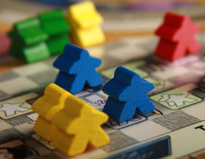
Workers: Being a worker placement game, the workers are a central part of the game. The prototype copy I have utilizes typical meeples in the 5 vivid player colors. There is also a grey meeple which can be co-opted as a "temp" worker during gameplay.

Tokens: Tokens are used to represent the seven different types of goods that players can collect during the game: Wood, Stone, Brick, Tar, Concrete, Steel, and Glass. Each type of resource token is color coded, and displays an icon identifying the resource. Money is also represented with tokens instead of flimsy paper bills, which scores bonus points from me.

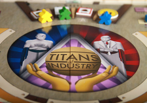
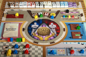
Board: The game board is large, and manages to capture an art-deco feel in the shape and structure of the office that it represents. This makes the board clear and understandable, as well as pleasant to look at.

Gameplay:

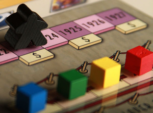
Gameplay follows the standard worker placement model, with a few twists. The game takes place over 7 years, with each year equating to a game turn. Each game turn is further split into phases: purchasing buildings, placing workers, resolving workers, and cleanup.

Each turn starts with the opportunity for players to purchase factory and business cards. These cards represent buildings and upgrades that generate goods, money, and victory points for the player. The buildings that the player chooses to buy can have a large impact on how the game plays out. During the course of the game, players will usually find themselves utilizing their opponents' factories and businesses in order to generate and sell resources. This means that purchasing buildings that are in demand can net the player a lot of victory points - however, he needs to be careful not to become too reliant on others in the process.

Next, the players will place their workers. Players may put workers on one of the many spaces on the board which allow them to gain basic resources, bend certain rules, acquire new goals, or gain new workers.  Players can also place workers on their own buildings, or their opponents buildings. Utilizing these buildings is the very core of Titans of Industry.

Divided into two types, Factories and Businesses, the buildings drive the producer-consumer economy of the game. Factories generate resources for the player using it, while businesses consume the resources and reward the user with money or victory points. It is to the player's advantage to select the factories and businesses that give him the best payout and align with any special goals he may have. However, he must be careful - when a player places his worker on a business or factory that doesn't belong to him, the owner of the factory automatically receives some victory points. This can make for tough decisions when a player has to decide if the benefit of using the building is worth helping his opponent in the process.

After everyone has placed their workers, the player's actions are resolved. This happens in an order that moves roughly clockwise around the board. During this phase, players receive goods, sell goods, and gain special actions or cards based on the actions that they have taken.

On certain years, players must pay rent on the buildings that they own. This happens after all actions are resolved, during the upkeep phase. Hopefully the player has earned enough money to cover these costs, otherwise he is required to take out high interest loans that must be repaid in order to avoid a stiff victory point penalty.

Play continues this way until the end of the seventh round, when players count up the victory point value of all of their buildings, goods, money, as well as any bonus points they have earned from successful corporate strategy goals.

The person with the most victory points is the winner and can revel in his obscene wealth - for the next two years, at least - until the stock market crash of 1929 causes him to lose the shirt off of his back.

Conclusion:

Titans of Industry is a solid game that really deserves to be made. With so many worker placement games out there, it is sometimes hard to look at a games description and immediately see it's potential - but ToI definitely has it.

Surprisingly, Titans turns out to be a very social game; even though the rules expressly forbid direct trading, the fact that players must utilize the other players' buildings to succeed introduces a definite social element. This aspect of the ToI reminds me a lot more of games like 7 Wonders than Caylus. While Caylus has a similar mechanic where players must pay rent to use opponents' buildings, Titans does it in a way that is much more congenial. In fact, the mechanics in the game that govern businesses actually reward players who choose to cooperate, by awarding a bonus when multiple players are on the same building. This design choice transforms the entire nature of the game from a cutthroat competition to a more subtle balancing act. That's not to say there isn't plenty of opportunity for backstabbing or opportunistic play, it just manifests itself in a way that isn't as obviously antagonistic as many other worker placement games.

Players that like to build economic engines will especially enjoy Titans of Industry. The process of purchasing and upgrading buildings, producing resources, and turning those resources into money really speaks to the part of me that loves civilization building games and likes to pump out long card combos in Dominion. It feels odd to say that, because Titans of Industry is very much in the Economic Worker Placement camp and shares very little in common with Dominion or Civ games; yet it somehow manages to scratch that itch for me.

I really appreciate the art style and theme of Titans of Industry as well. Watching it evolve from a spartan prototype with an almost monochromatic color scheme, to the colorful art-deco inspired incarnation that it is today has been exciting. I can only imagine the potential that the game could reach with the proper funding to be professionally printed.

I fear that with only a little over 2 weeks left in its Kickstarter campaign, Titans of Industry may face an uphill battle to secure the rest of the funding it needs. It is a game that really deserves to be played, and I am glad that I was given the opportunity to purchase a prototype copy. If you are sitting on the fence about this one and like worker placement or economic games, I would urge you to head over to Kickstarter and pledge for a copy of your own. I don't think you will be disappointed.


Monday
Feb132012

Prêt-à-Porter - A Review


And so there I was, front row center in New York's fashion district, watching as the next season of clothing strutted across the catwalk. I wiped the cheese dust from my fingers, and casually stroked my fashionable neckbeard. (From what I could tell, neckbeards appeared to be trending last season in Milan.) The auditorium dimmed and I waited, nervously.  Right Said Fred's "I'm Too Sexy" began thumping from the sound system as the lights rotated into place, illuminating the thin walkway that my models were about to grace.

My first model set foot on the stage... and there was a collective gasp of horror from the audience. My worst fears were realized! I had spent all of my money following trends, and paid no attention to the quality focused market here. I made a gamble by trying to save money on inferior materials, but the audience definitely wasn't buying the "Burlap Chic" angle. This would be the end. I had borrowed money on empty promises and the hope that "Meeple Tees" would take the world by storm. Instead, my kneecaps had an inevitable meeting with Guido in the alleyway. It was this painful regret that would spell the end of my career as a fashionista... until the next game of Prêt-à-Porter, at least.

Ignacy Trzewiczek has always impressed me with his game design. I gave solid marks to his fantasy siege title "Stronghold" and I was very excited to see what he had been cooking up at Portal Publishing in the past year. Luckily, his recent release, Prêt-à-Porter is now being distributed through Eagle Games in North America.

Surprisingly, this new game doesn't feature the castles, mutants, or postnuclear settings that Portal has become known for, instead opting for the ruthless world of off-the-shelf fashion. While I might have originally been a bit nonplussed by the fashion theme, once the confusion passed, I was happy to recognize Prêt-à-Porter for the deep, meaty, worker placement oriented business simulation that it is. 

In Prêt-à-Porter, players are growing a fashion business from the ground up, and trying to find success in an ultra-competitive market. Gameplay revolves around managing money; purchasing designs and materials; as well as managing a staff of workers, real-estate, and contracts with the ultimate goal of selling Prêt-à-Porter (ready to wear clothing) through a series of fashion shows. The player who can best juggle all of these aspects of business will make the most money and emerge as the next Vera Wang of board game simulated fashion.

Click to read more ...